
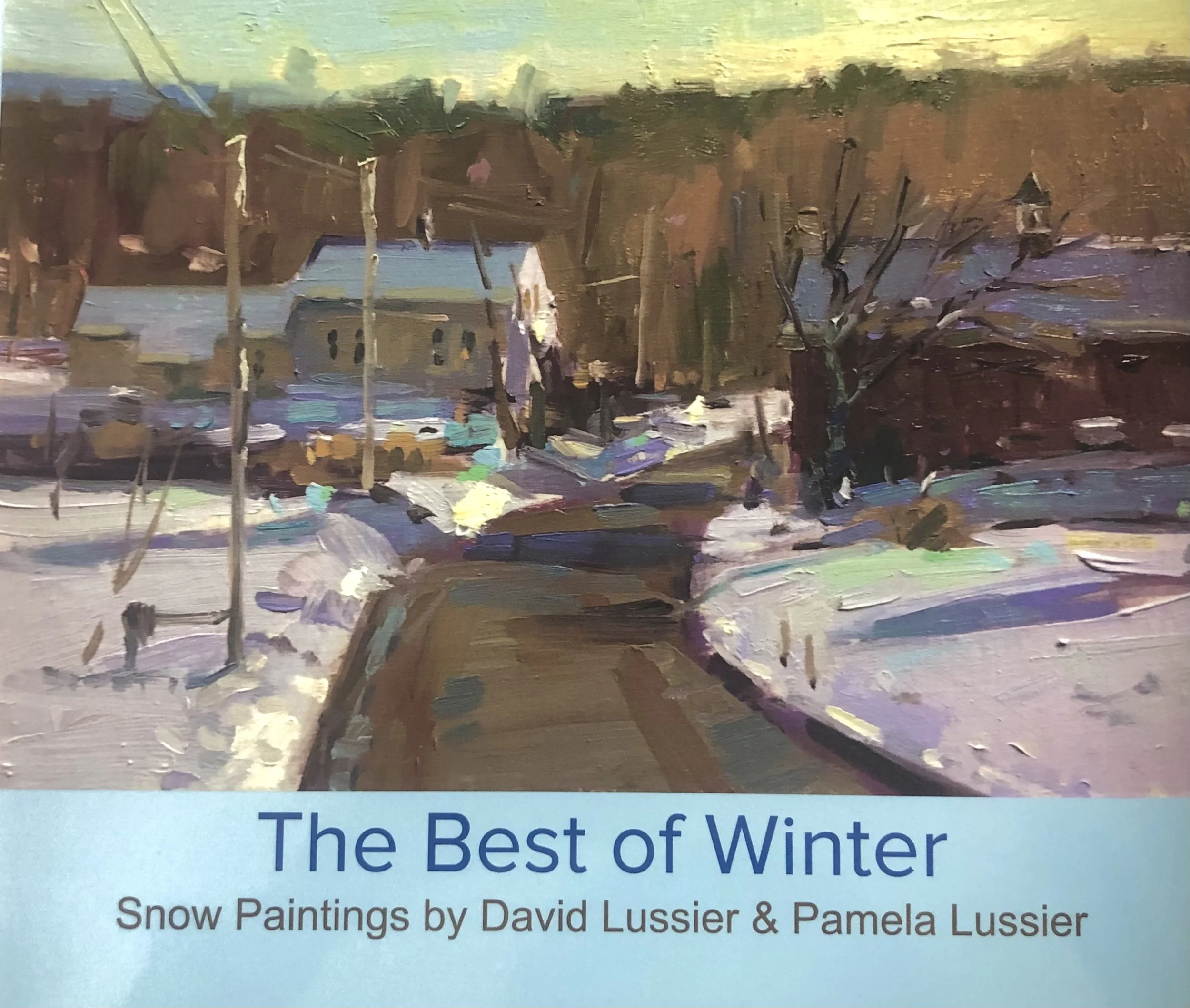
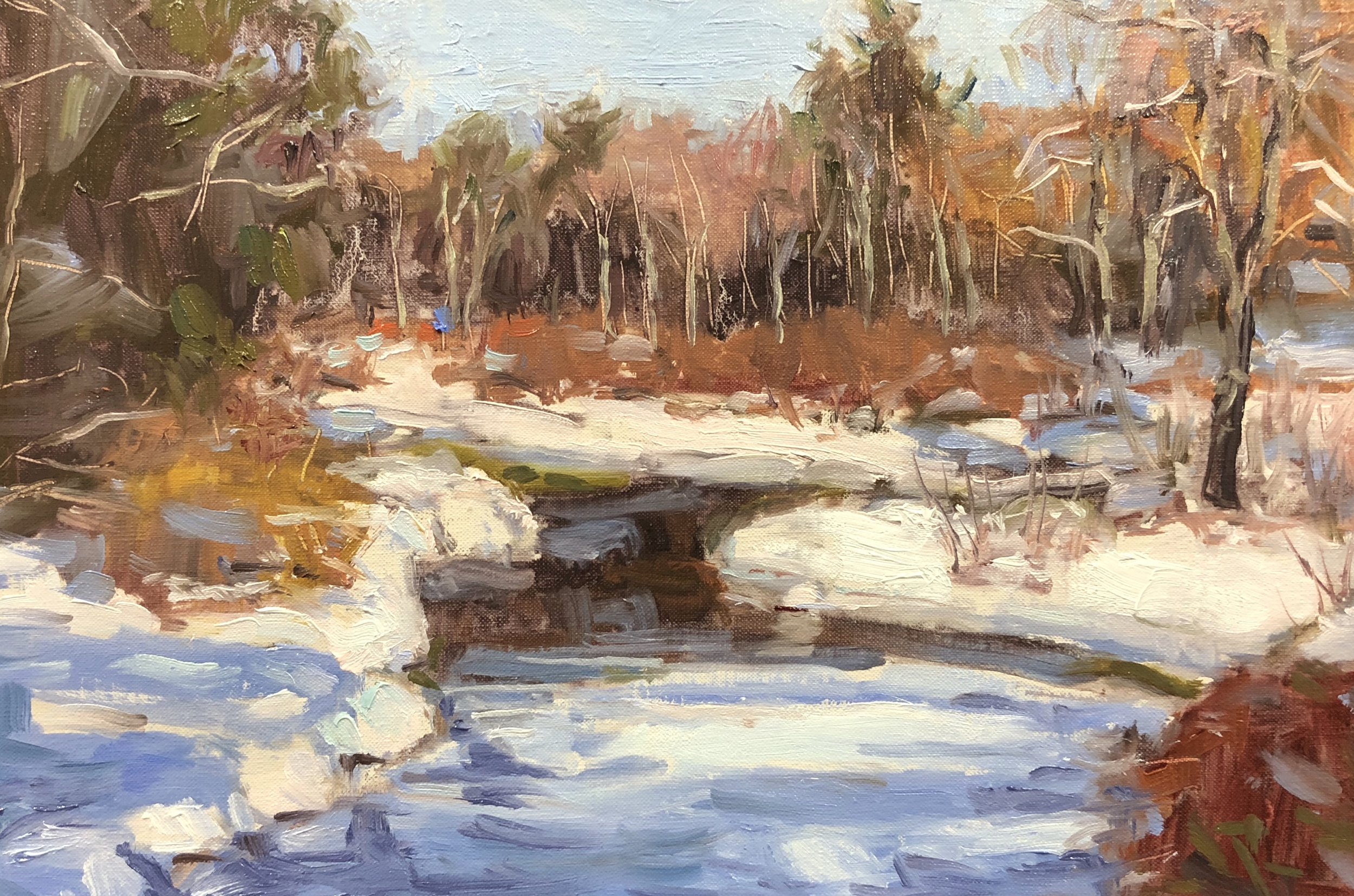
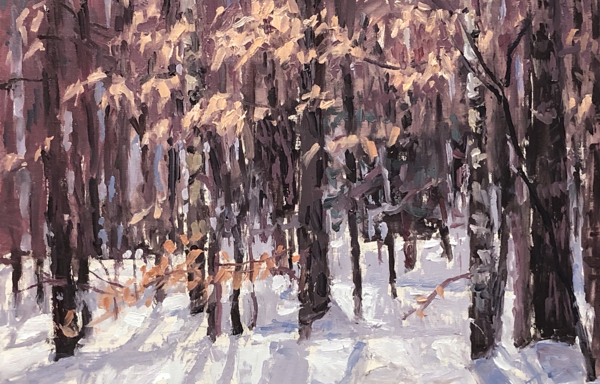
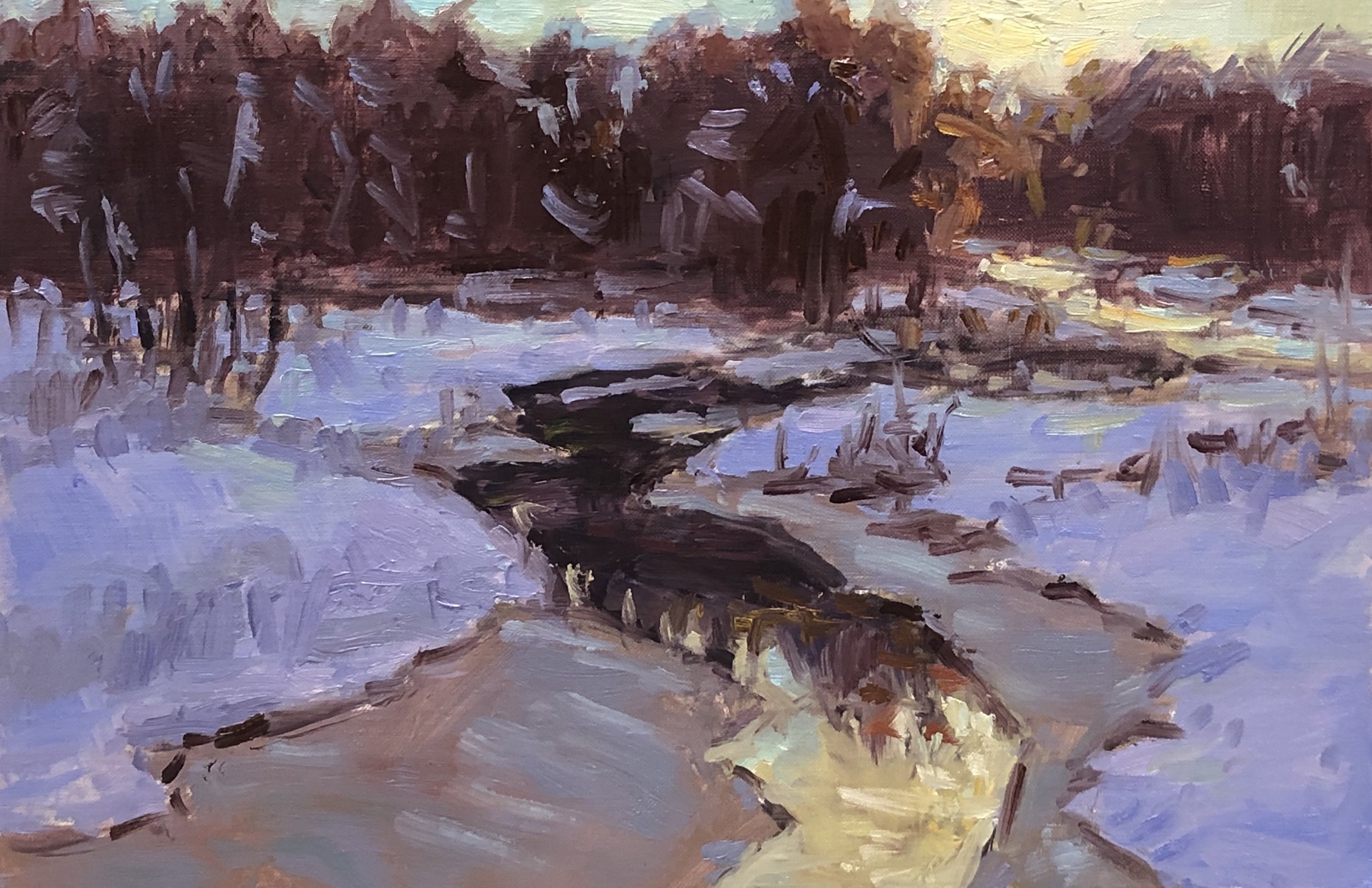
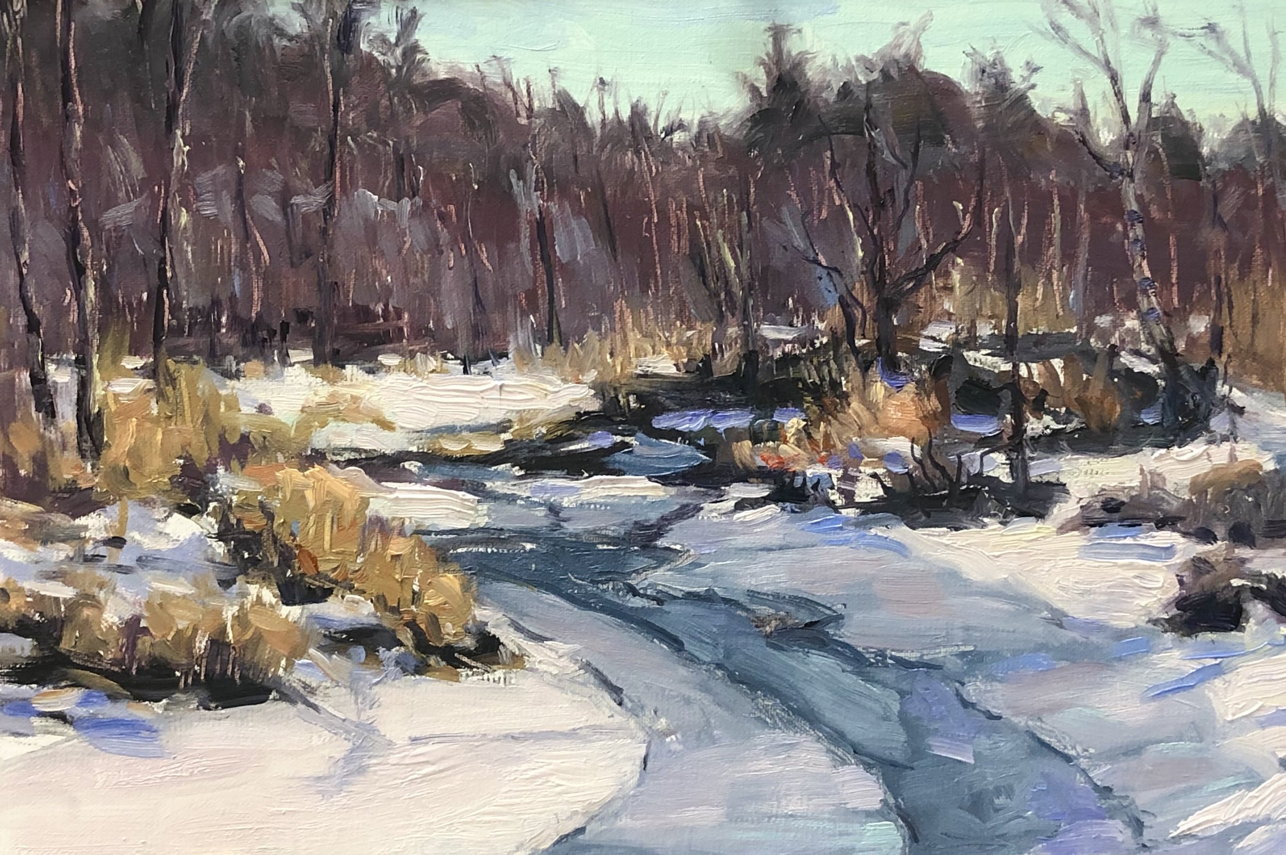
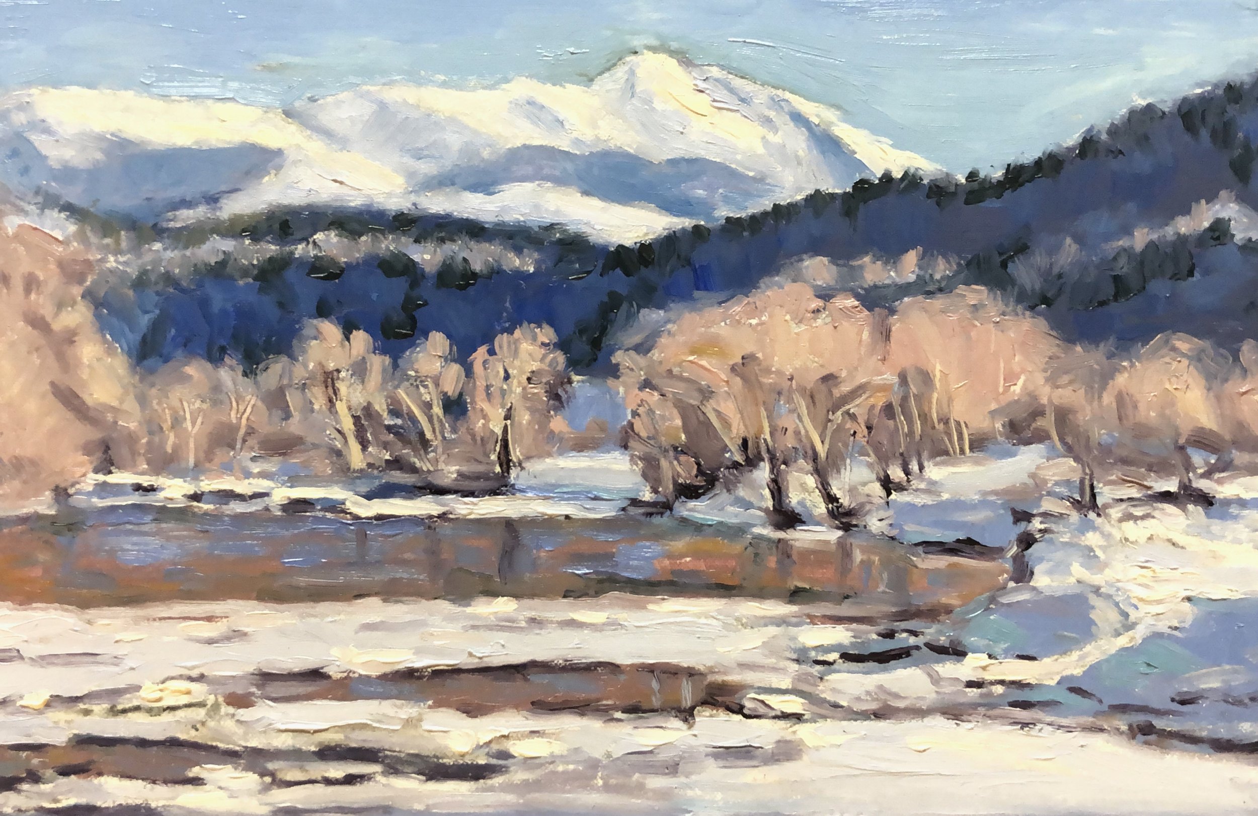
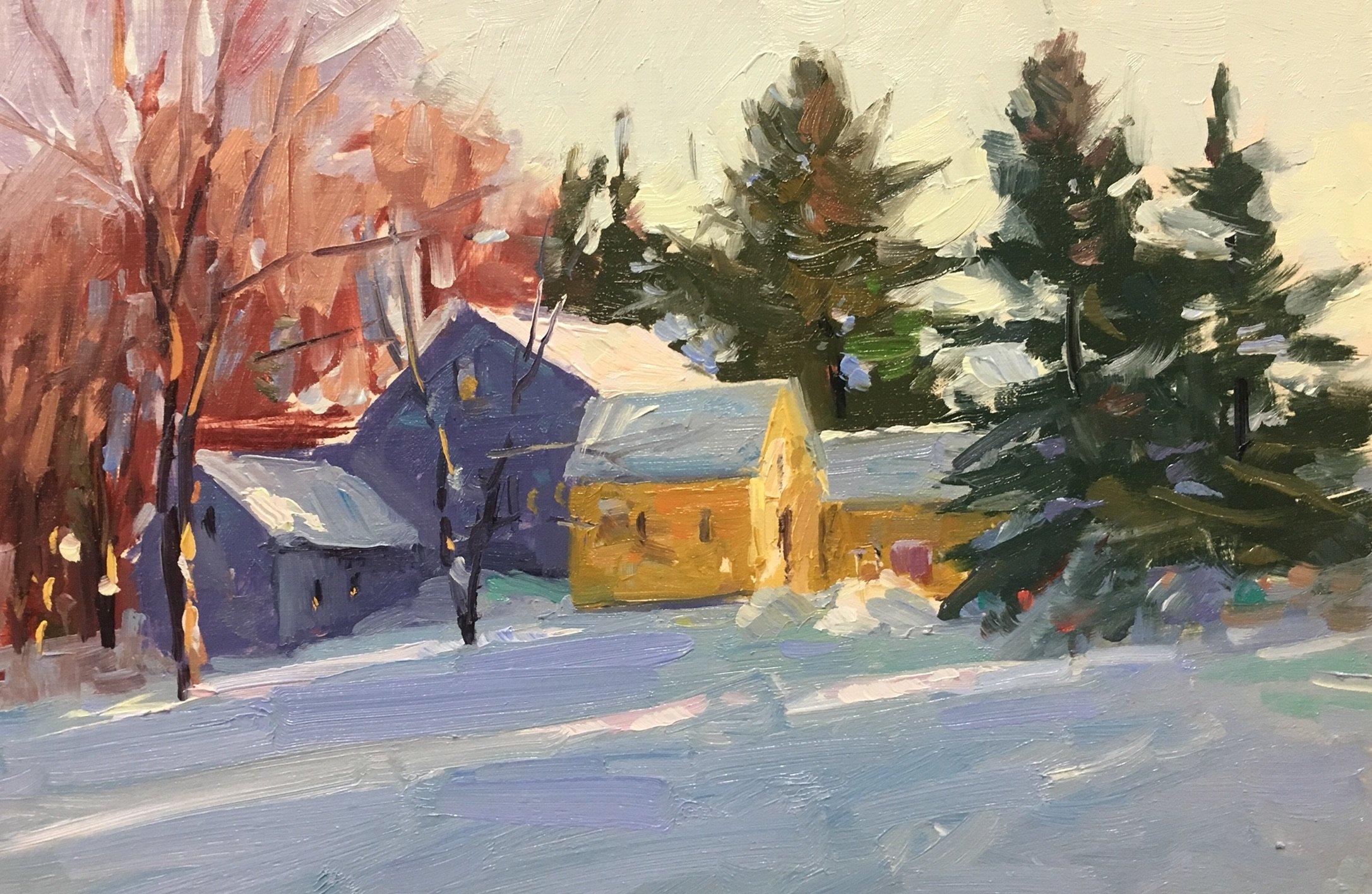
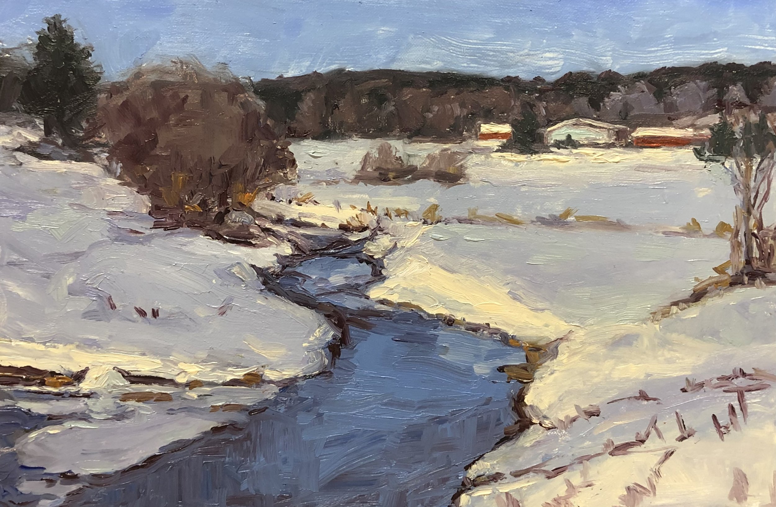
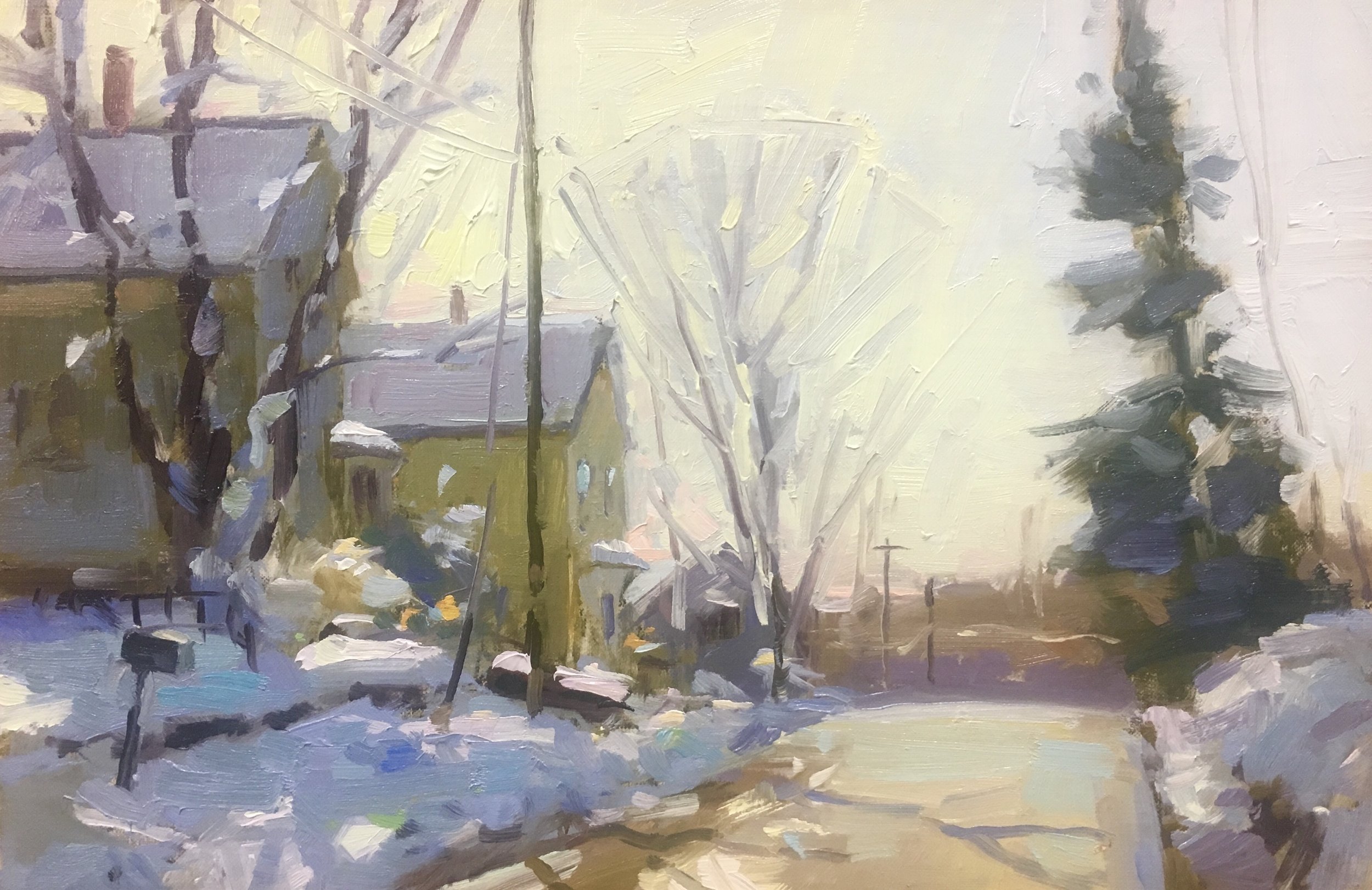
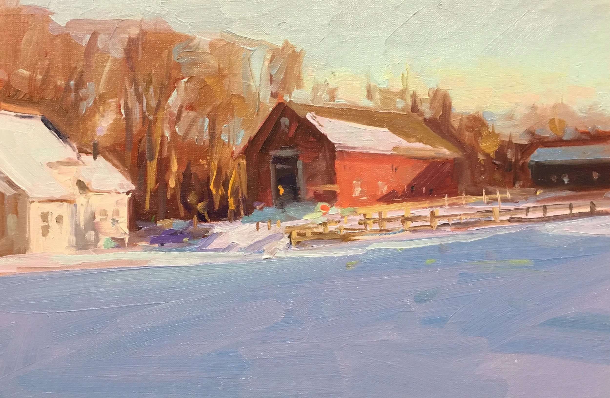
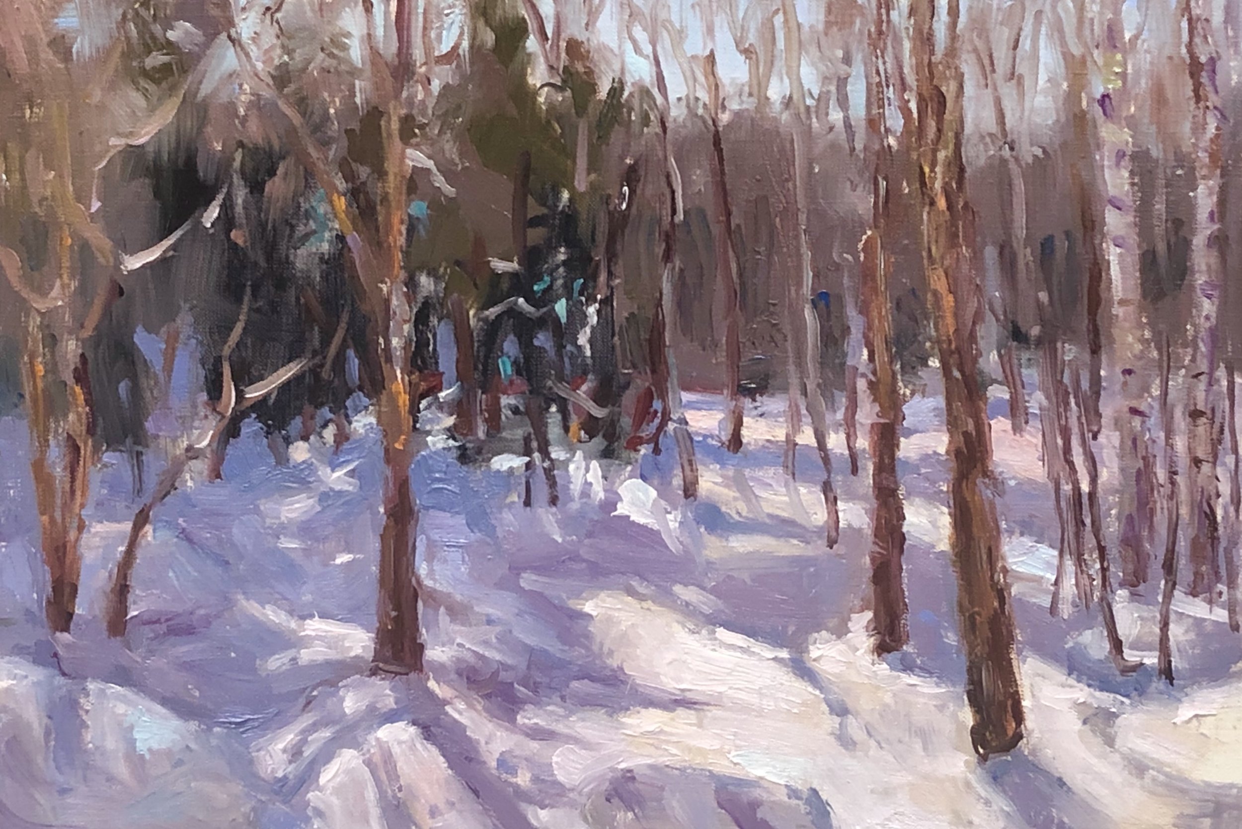
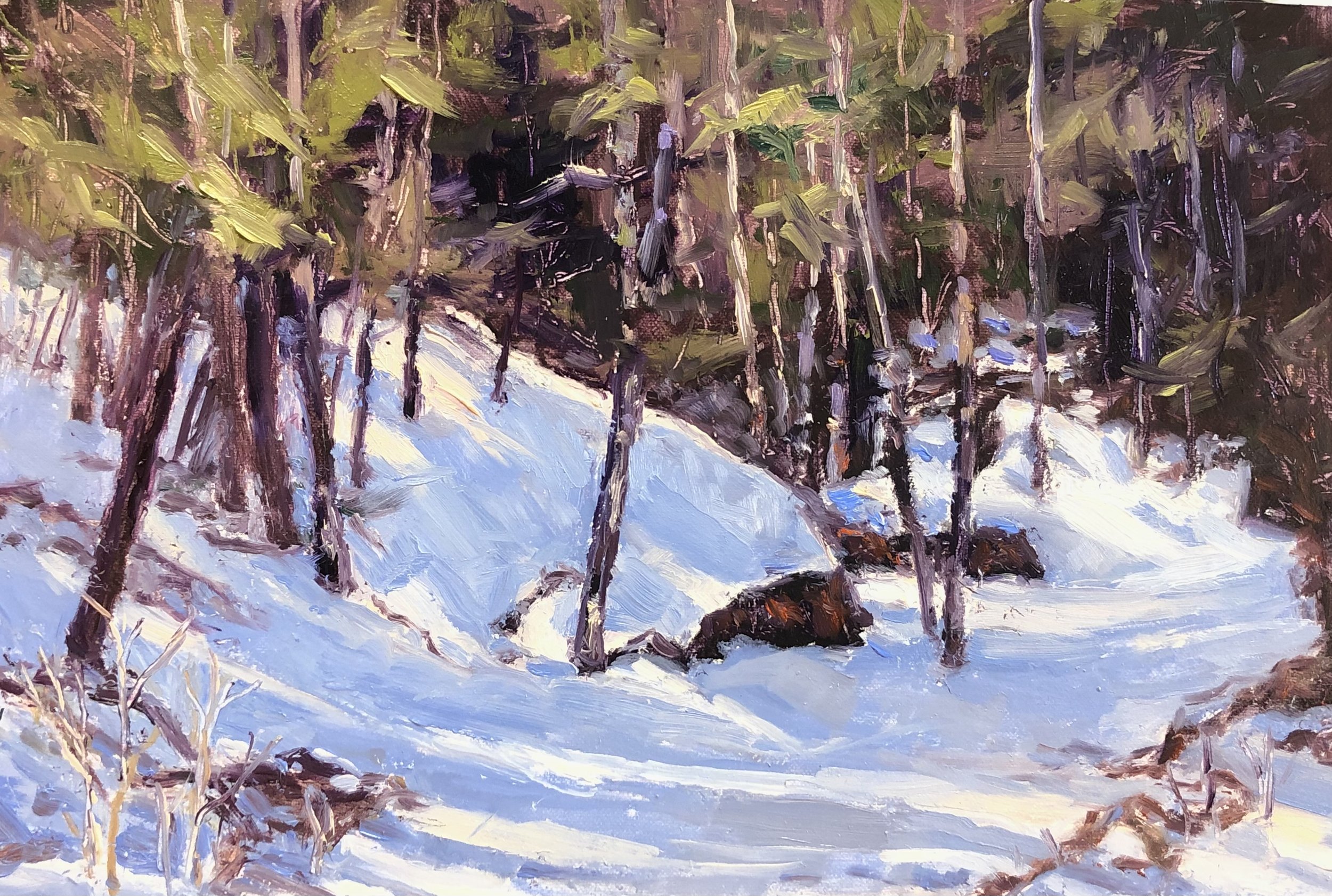
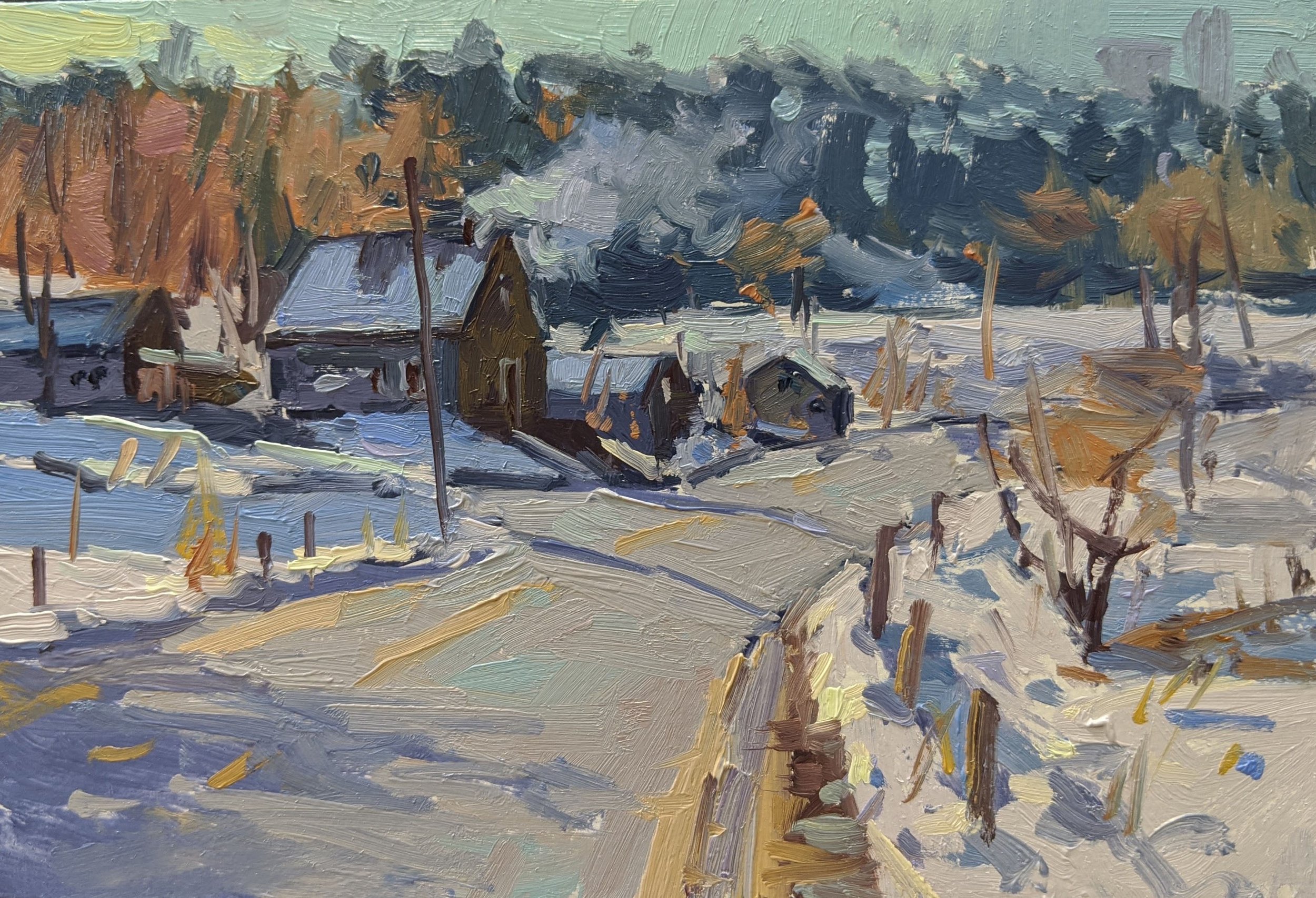
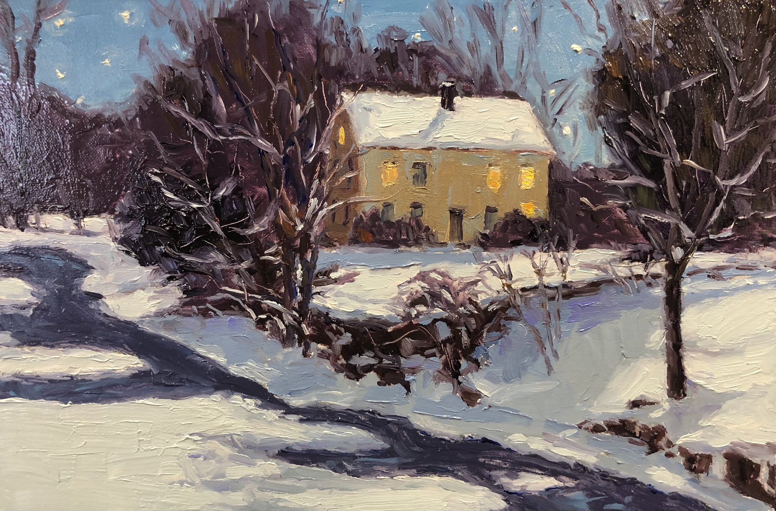
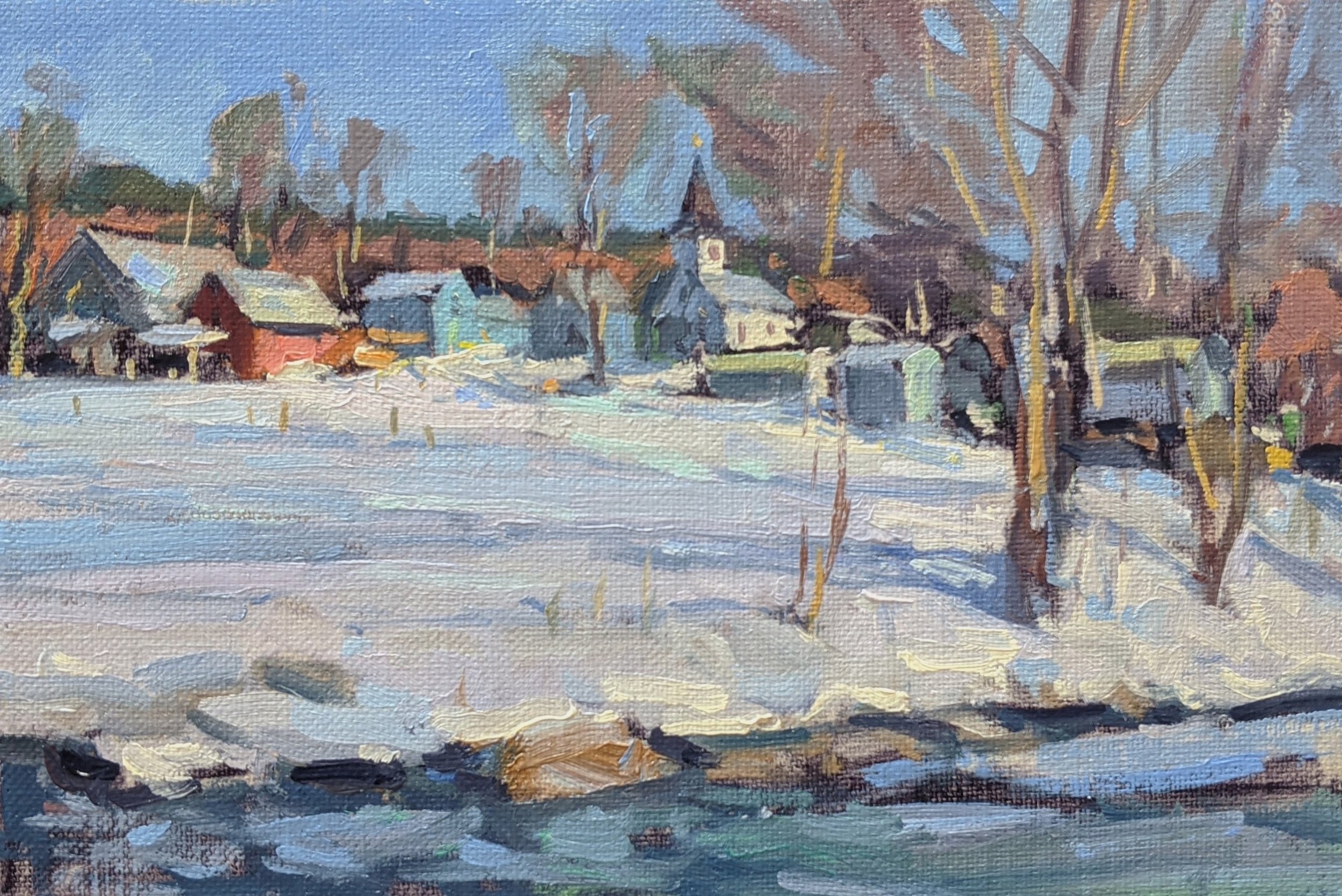
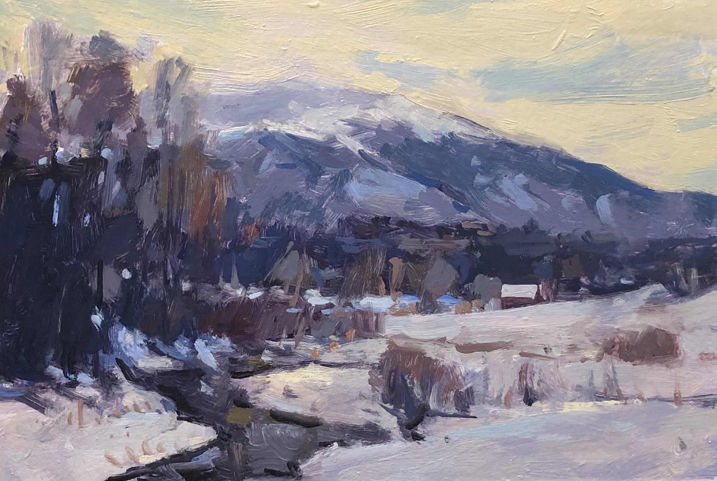
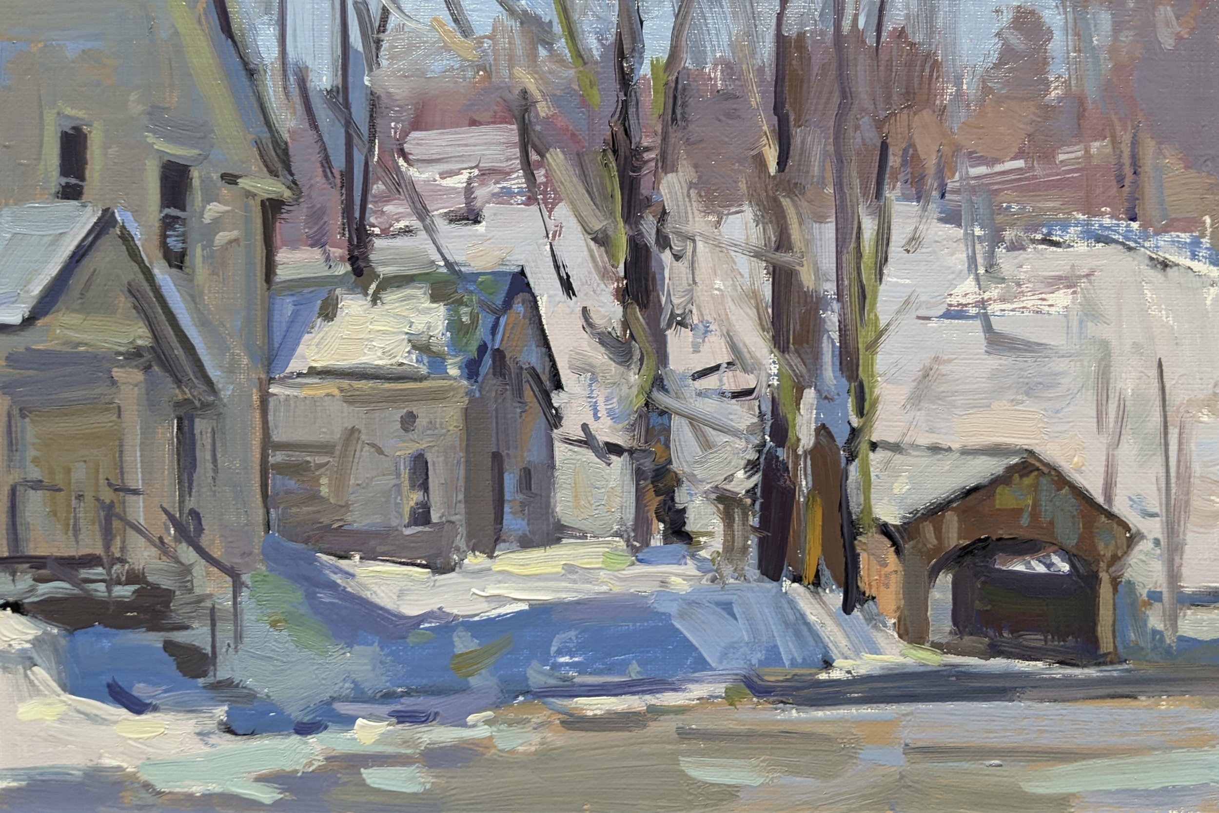
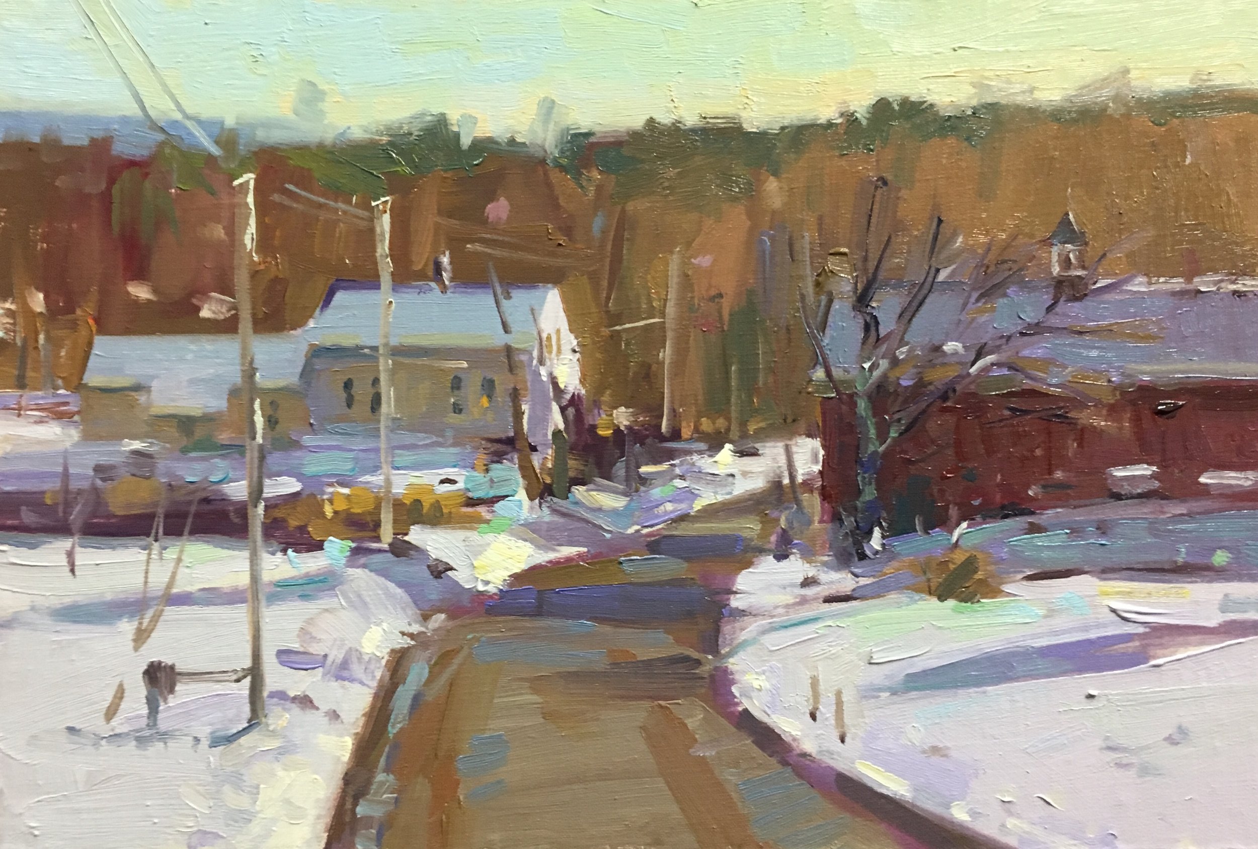
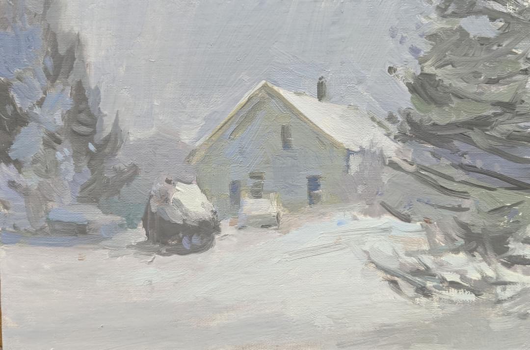
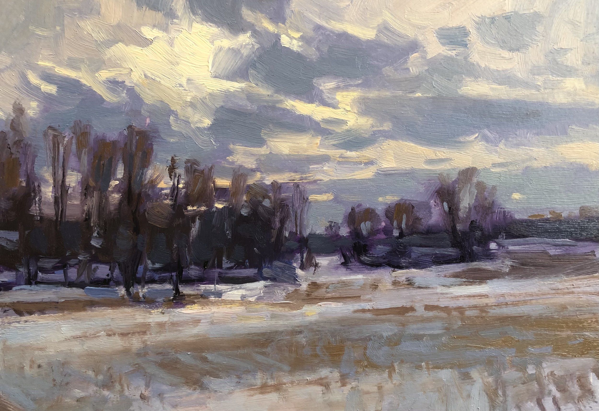
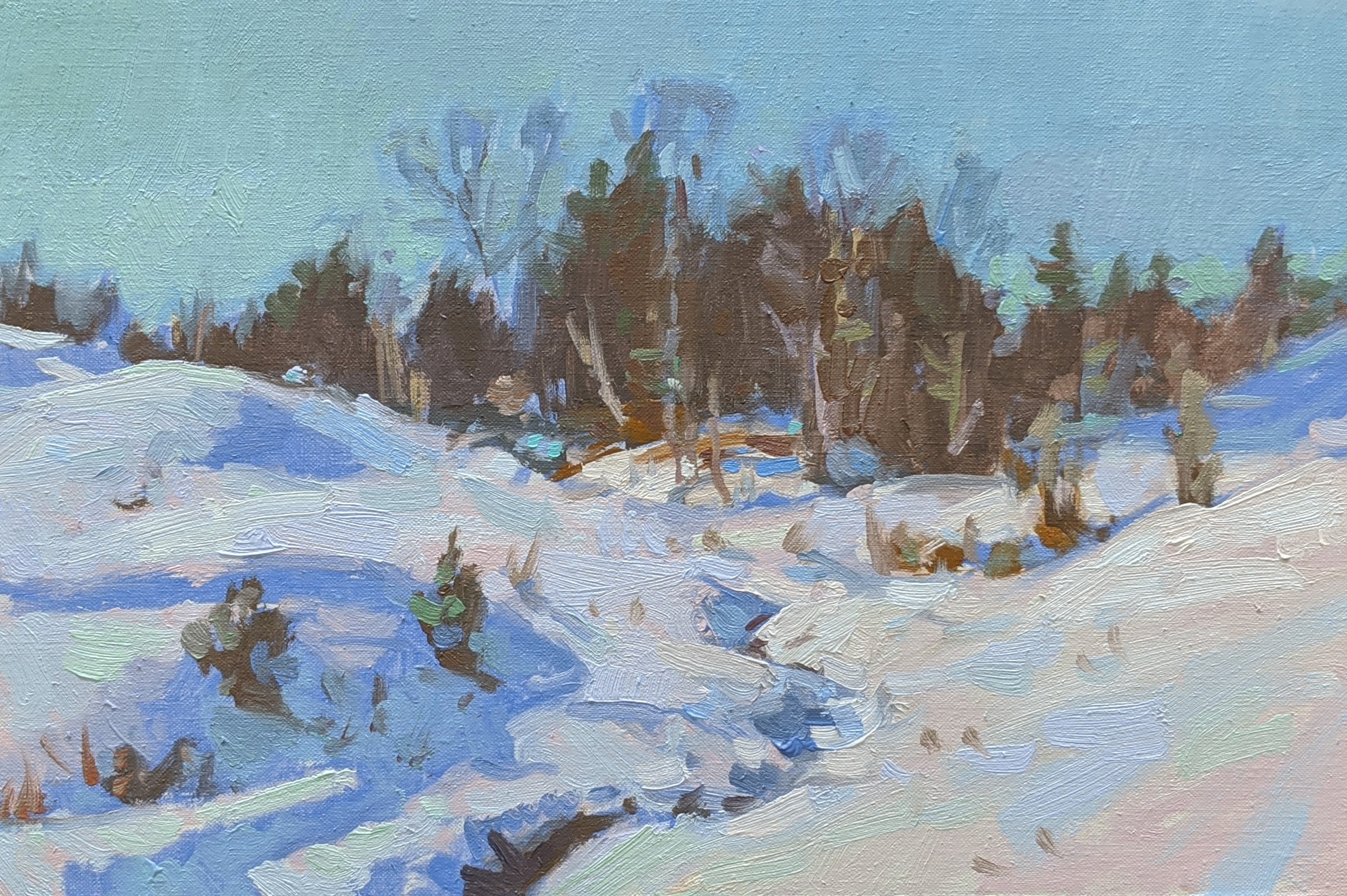
The Best of Winter Book Images
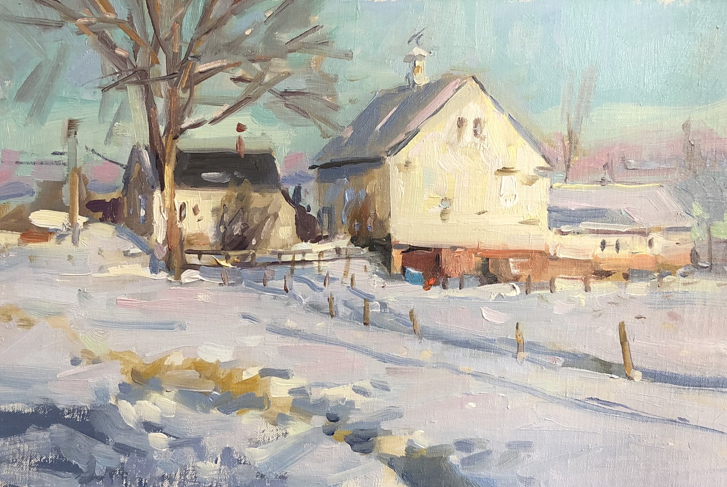
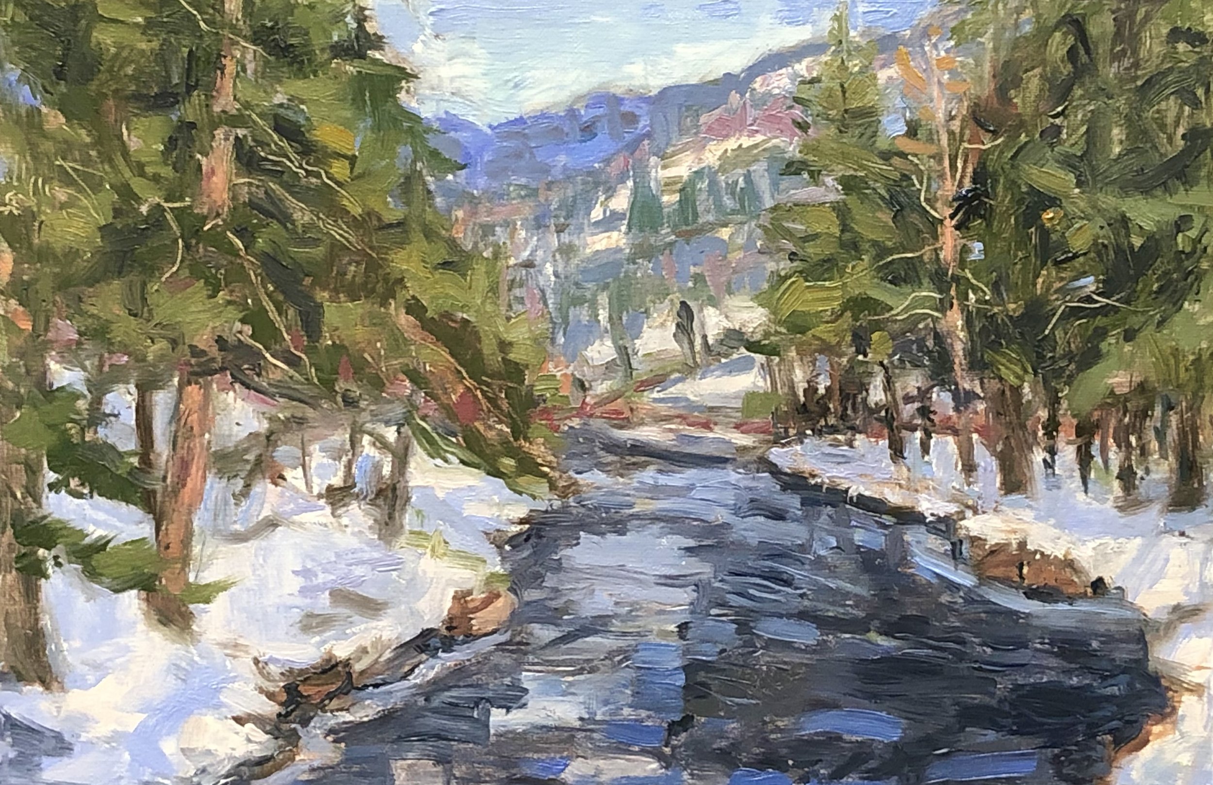
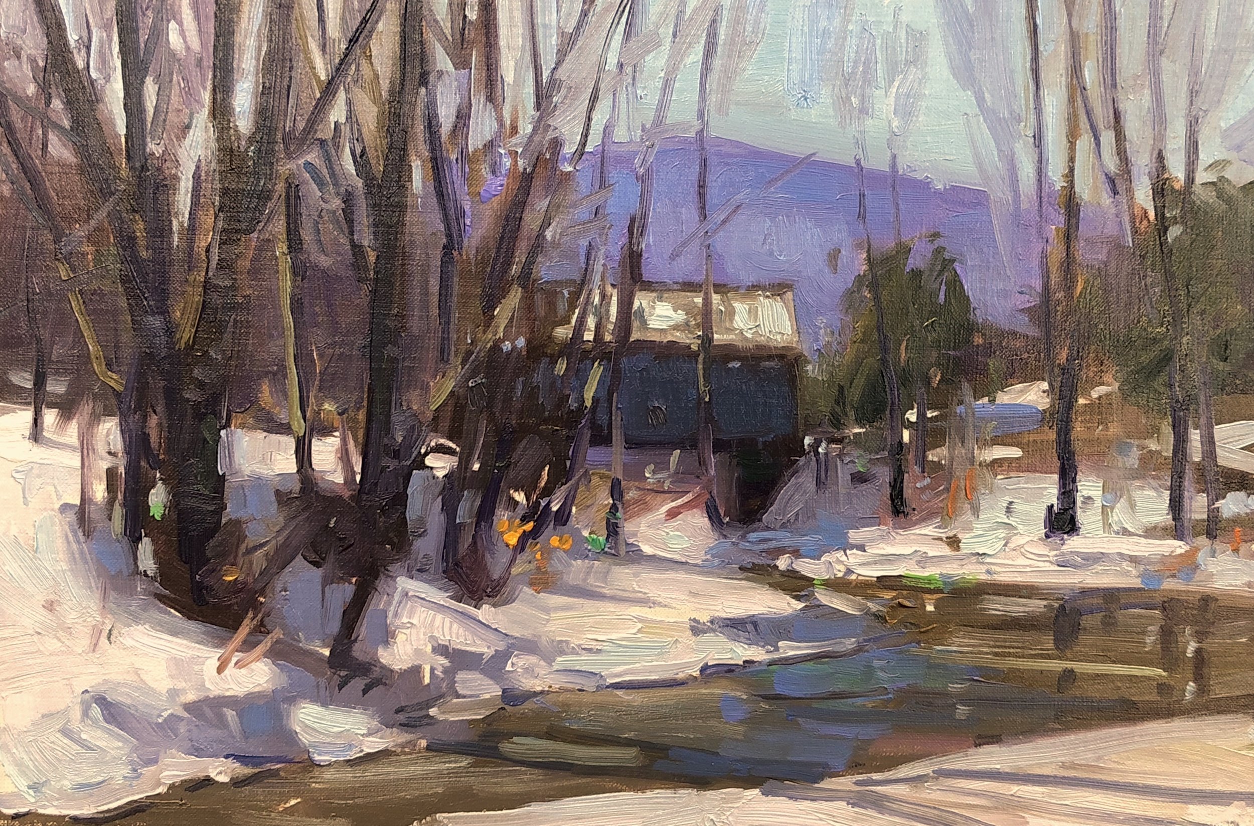
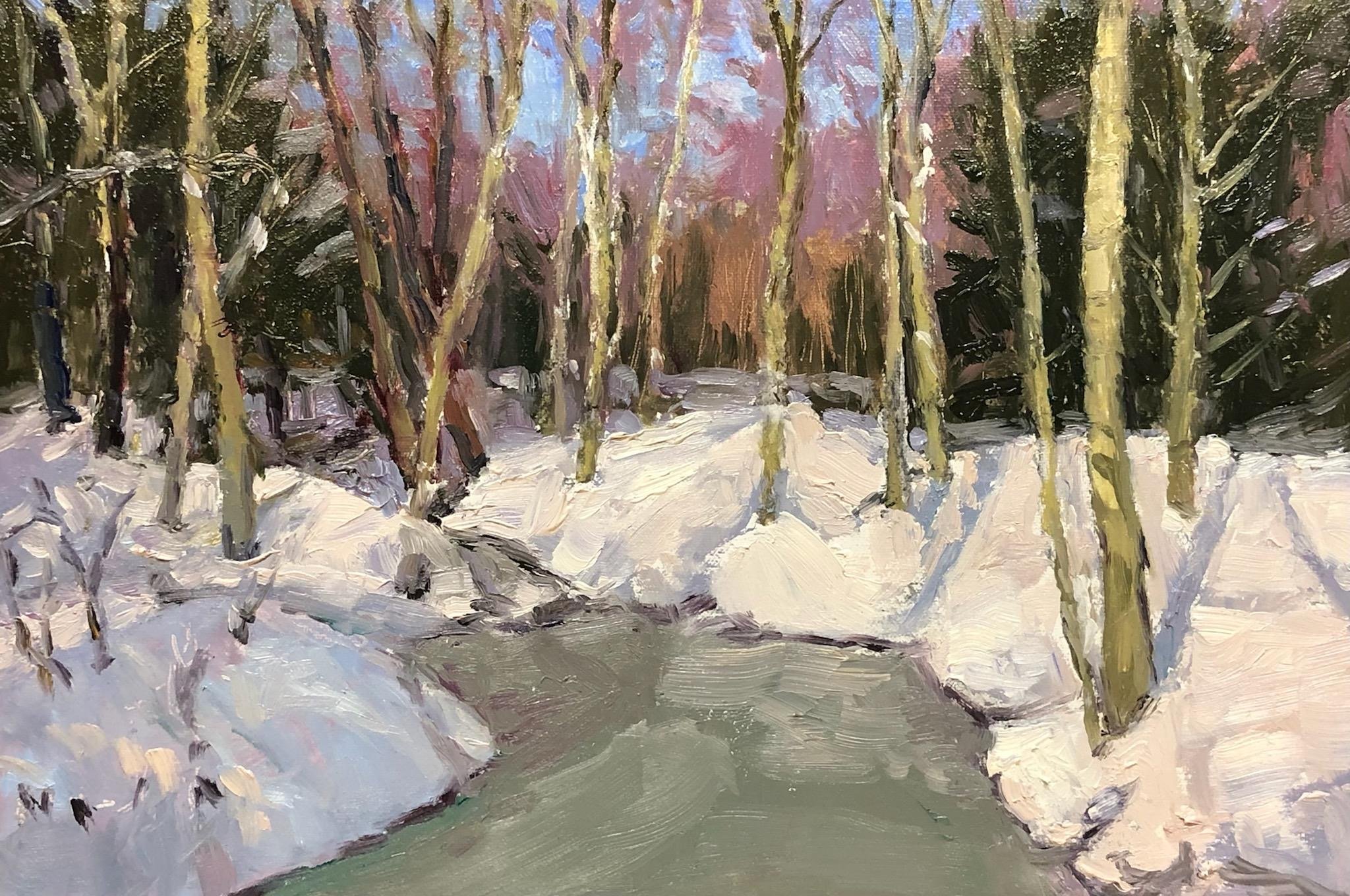
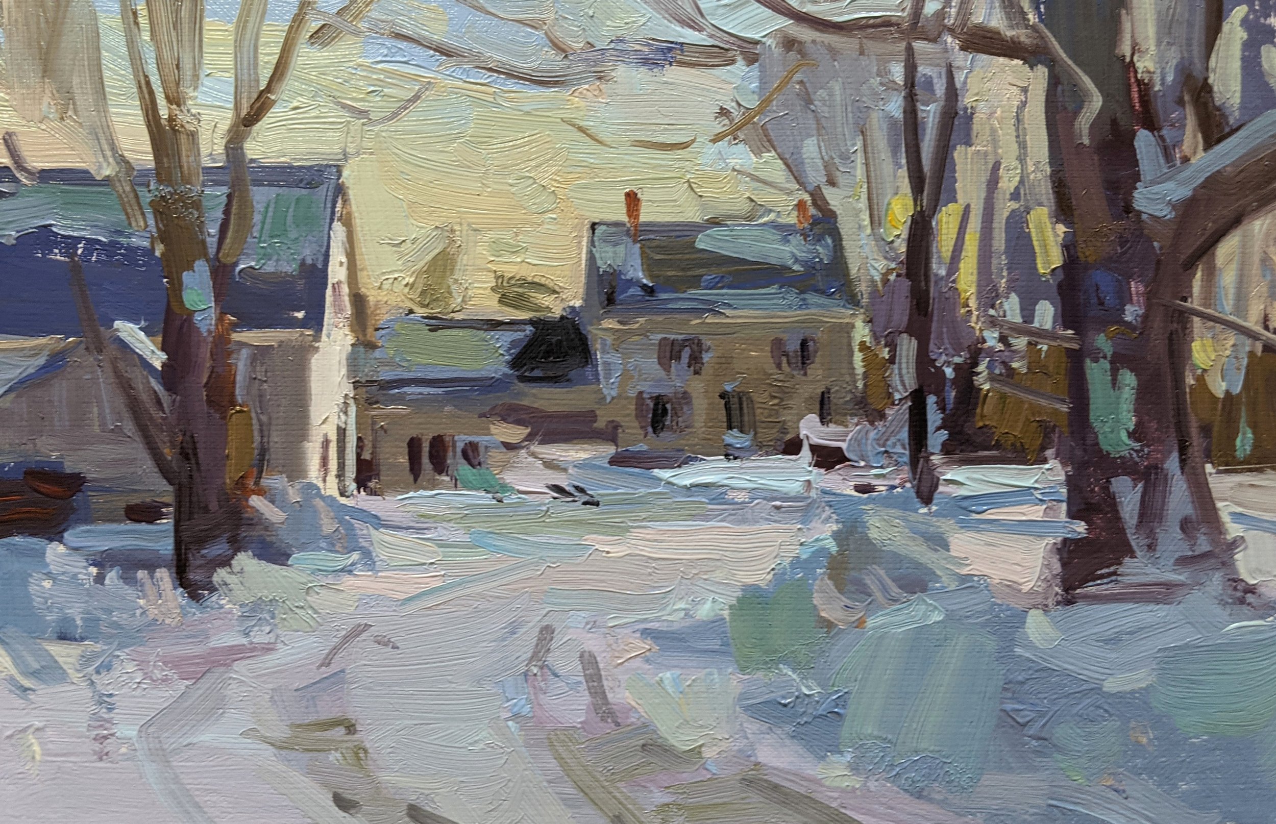
This book is a collection of twenty-eight winter landscape paintings by husband-and-wife David and Pam Lussier. Each year in December, over the course of twelve days, artists David Lussier and Pamela Lussier will paint a winter snow scene, and both produce a painting a day. The 'Best of Winter' is a collection of their favorite images so far.
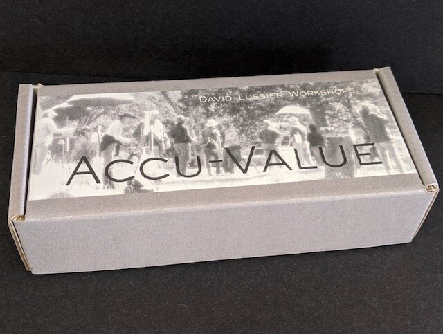
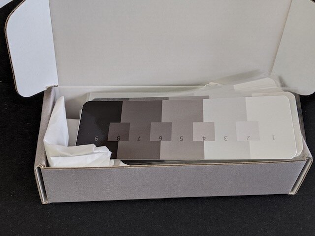
ACCU-VALUE - Value Scale Packs of 20
John Singer Sargent was known for his impeccable ability to record values perfectly. As a matter of fact, all great paintings make use of the same nine values between black & white that Sargent had at his disposal and the painters behind these works knew how to properly use consistent values to make their paintings sing with truth. These super easy to use Accu-Value scales are highly effective and will make a difference in your work right from the start. We’ve all heard the saying that value does all the work, but color gets all the credit. This saying is one of the biggest truths when describing the painting process. We all love color, but if we can learn to nail our value jumps consistently and correctly, we have the ability to make our fair share of successful paintings.
-
• Takes the guesswork out of mixing the correct value.
• Hands-on tool that makes checking values a cinch.
• No more juggling and constant correcting to get values right.
• A little extra effort to check values will save time in the end.
• You will see instant improvement in your paintings.
• Handy pocket size to use individually in the field or in the studio.
• A box of Accu-Value cards fits easily into a back pack with other plein air gear.
• Simple and easy to use.
• Great for teachers and students.
• Coated surface allows the value cards to be wiped clean and reused numerous times.
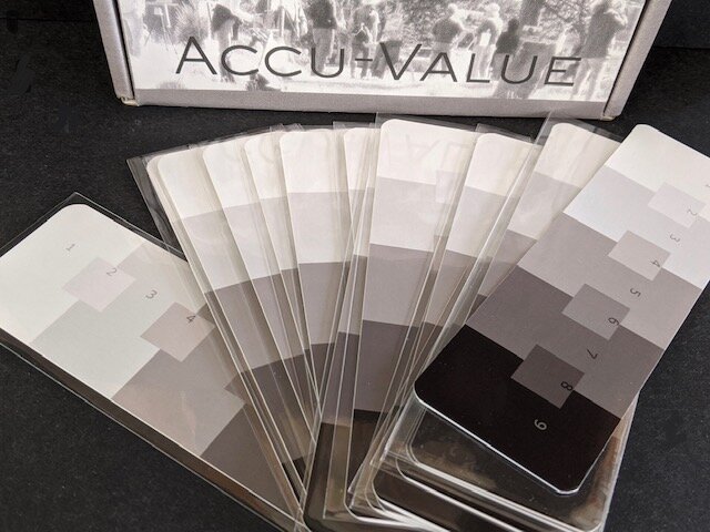
• Each Accu Value card comes in its own protective sleeve.
• Works for all media. (watercolorist’s can judge their values by putting the Accu-Value card against their work.)
• Consistent use of checking values against the Accu-Value cards will improve the users ability to mix values correctly the first time.
-
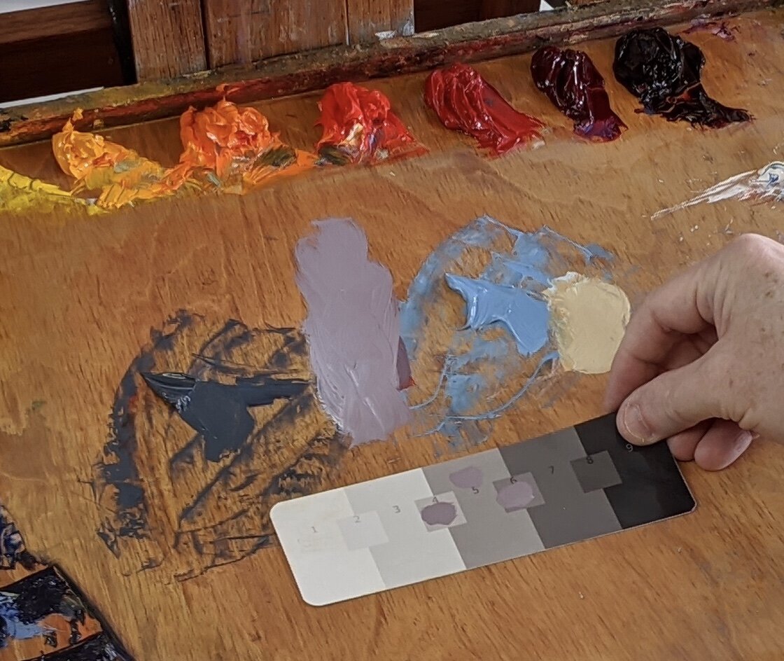
Whether you like to mix your paint directly with a brush or use a palette knife to make individual paint piles, the simplicity of checking values against the Accu-Value card is the same. Simply brush a small amount of the color that you’ve mixed onto the Accu-Value card to see if your value is correct. Let’s say you want a middle value 5. Place a dab of paint onto the 4, 5 and 6 value squares on the Accu-Value card and squint. For the intended value to be correct, the paint dab, regardless of color or intensity, will disappear into the middle gray 5 value and the dabs of paint on the 4 and 6 value squares will appear too dark and too light respectively. By judging all your values in this way, especially when starting a painting, you will have consistent value jumps that will read correctly to the viewer.
I talk to students about the importance of consistent value jumps all the time in my workshops and I encourage them to break down all the major shapes in a painting to just a few values to begin with. Once the big value shapes are correct, the rest is much easier. In a typical sunlit situation, the value jumps between objects have to be consistent. For example, a white object in sunlight will stay a 1 value in sunlight and then jump to a middle value 5 in shadow. A halftone will be somewhere in the middle of these two value jumps. A black or dark object in sunlight will become a 5 value in sunlight and stay a black 9 value in shadow. Any halftones will roughly be somewhere in the middle of these two value jumps. A middle value object in sunlight will become a 3 value in sunlight and drop to a 7 value in shadow. The halftone will once again fall somewhere roughly between these two values. Accu-Value scales allow the artist to properly check for these consistent value jumps between different colored objects.
-
The image below right shows the correct value ranges of all objects between sunlight and shadow, regardless of their inherent color. Many students simply think of the value scale in a very abstract way, but they don’t understand how to use it effectively. Therefore they miss out on one of the most important aspects of painting. I’ve asked students to mix up a value scale in some of my classes and they simply put white on one end, black on the other and then proceed to mix other values in-between the two extremes. If the values that they mix all look somewhat different from each other and fall somewhere between the white and black extremes, they feel that they have made a successful value scale.
A correct value scale has consistent value jumps between white and black. The value step between white and the 3 value is equal to the value step between the 3 and 5 value. The same is true of the consistent value steps between the 5 and 7 values and the 7 and 9 values. Without the consistent value jumps, value scales have no truth to them.
I can remember making lots of value scales in art school. As a student, I remember being asked to render value scales in graphite. I remember being asked to render them in watercolor and in gouache and then in oils. I can remember wondering through four years of art school, when I would ever be done having to think about value scales. Well, that was 38 years ago and I still think about the value scale every single time I paint. Correct values are really that important. You can’t get away from them. If your values are correct in a painting, almost any color will suffice.
The Accu-Value cards are something that I’ve been using with my students for more than 25 years of teaching classes and workshops. The students who consistently use them gain a full understanding of how important values are to the success of their work and it shows.


“Color is an inborn gift, but appreciation of value is merely training of the eye, which everyone ought to be able to aquire”
- John Singer Sargent
My book ‘MY NEW ENGLAND’ is filled with 51 images of my favorite works that I’ve painted over the years.

Introduction
From the umber fields of a freshly plowed Connecticut farm to the rugged snow-capped New Hampshire peaks and from the breathtaking display of autumn foliage on a Vermont hillside to the ocean-polished cliffs of the Maine shoreline, New England’s beauty is readily apparent. I’ve lived all my life in New England, yet still I see its beauty anew each time I watch waves crash, hear crisp amber leaves crunch underfoot or feel the wind bite my face after a new snowfall.
Just as the word home carries a connotation far deeper than a structure with four walls and a roof, my canvases evoke so much more than the surface beauty of the landscape. The images may be of peaceful mornings, sparkling sunsets and impending storms, but my paintings also are a time, a history, an emotion and a bond to a region always beautiful, but at the same time unforgiving. I am both inspired by and connected to New England in a way that is unique. That is why a painting of a stunningly backlit and bucolic farmhouse on a country lane also evokes centuries of struggle to coax crops from the rocky soil. That is why a canvas depicting lobster boats tied at a wharf on a placidly shimmering ocean also conjures the toils of generations who risk their lives at sea.
I am a part of the landscapes that develop via layers, stroke by stroke, on my canvasses. I am more than an observer of New England. I am one with all its seasons, moods and its very essence.
Best Wishes,
David Lussier